Case Study: Lonely Whale

A web design solution to help drive the conversation around marine plastic pollution.
OVERVIEW
Non-profit organization Lonely Whale strategically influences conversations about marine plastic pollution to bring awareness and inspire change.
ROLE
Solo project. Conducted research, developed insights, and created a responsive high-fidelity solution.
DESIGN GOAL
A web design solution to help drive more conversations about marine plastic pollution among Lonely Whale's target audience.
DELIVERABLES
client/user interviews, user persona, user flow, storyboard, sketches/wireframes, user testing, responsive high-fidelity prototypes, front-end coded home page, UI Style Guide
TIMELINE
4 weeks (January 2019)
TOOLS
Adobe XD, InVision, GitHub, VS Code
Collage of single-use plastic harming marine life and polluting the ocean
GLOBAL ISSUE

Marine Plastic Pollution Increasing Worldwide

  • Increasing consumption of single-use plastics
  • As of 2018, 90.5% of plastic not recycled
  • By 2050, more plastic than fish in the sea (by volume)
RESEARCH

The Problem Space

monitor icon

Website Audit

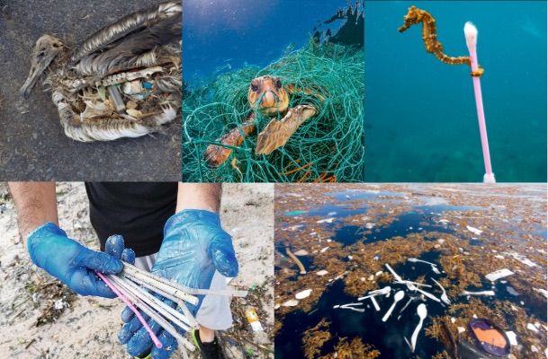
Before speaking with the client, I conducted a website and social media audit to examine the brand identity and possible user flows.

users icon

User Research

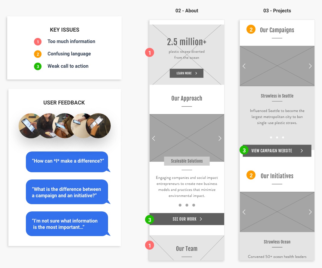
I conducted interviews with 5 members of the target demographic to understand:

  1. What is their relationship to non-profits?
  2. How do they decide which non-profits to support?
  3. What type of brands do they follow on social media?
briefcase icon

Business Research

I conducted an interview with the Director of Digital Strategy to understand:

  • Who is the target user?
  • What are the goals of the website?
  • What challenges has the organization experienced?
RESEARCH INSIGHTS

Major Findings

chat bubble with a question mark icon

No clear call to action

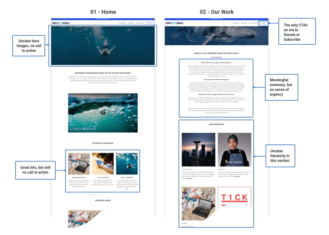
Lonely Whale has a strong brand identity and digital presence that is somehow missing from their website.

mobile phone icon

Target users = millennial women

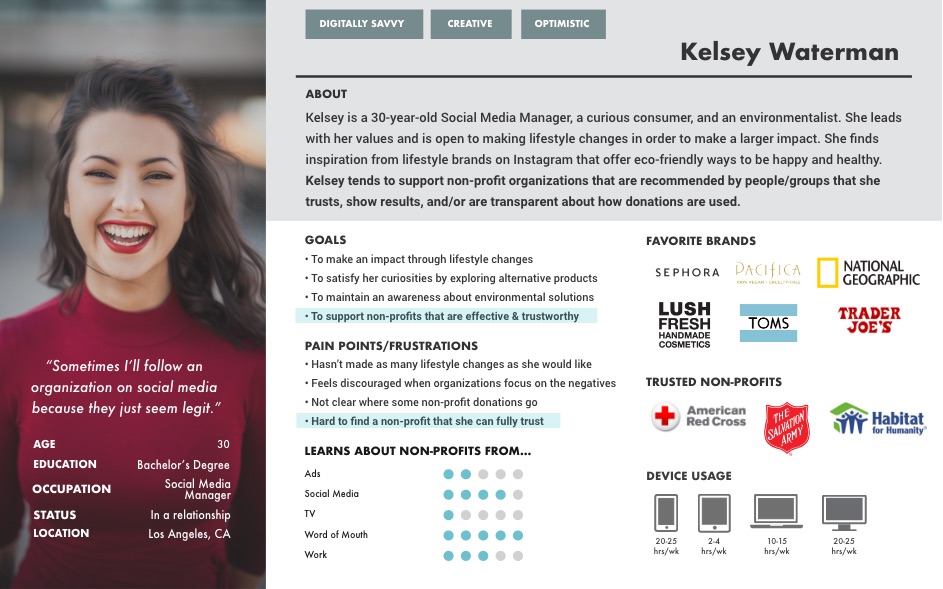
The target user is a digital savvy modern millennial woman who leads with her values. The challenge is getting the target user to take action and join the conversation around marine plastic pollution.

facebook messenger icon

Millennials rely on social media & word-of-mouth

Users learn about non-profits on social media and through word-of-mouth. Users tend to follow lifestyle brands that promote happiness & positivity.

shield with a check mark icon

Trust is key

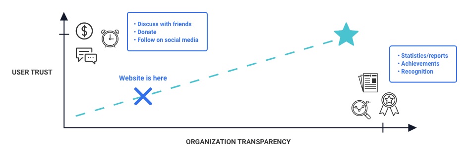
Users support non-profits that they trust. Trust is built through transparency of information.

Lonely Whale website audit shows no strong call to action
Website Audit: Lonely Whale's website contains no significant call to action.
User persona of a young woman who wants to support an environmental non-profit that she trusts
User Persona: The user wants to support environmental organizations, but will only support ones that she trusts.
DEFINE

Area of Opportunity = Build More Trust

In order for Lonely Whale to spark new conversations, the organization first needs to show millennial women that the organization is worth recommending.

Key insights: the user needs more information

Kelsey is unlikely to trust Lonely Whale based on its current website because the user needs more information to determine if the organization is trustworthy.

Value proposition: create trust through transparency

If Lonely Whale could communicate where the money goes and highlight their achievements, then that would create transparency around funding and direct impact. The user would be more open to a non-profit that represents her values and can be trusted with her time, donations, and moral support.

The value proposition shows that Lonely Whale can build user trust through transparency of information
Value Proposition: More transparency means more trust. More trust means more support.
INFORMATION ARCHITECTURE & UI DESIGN CONSIDERATIONS

Updated Sitemap, Maintain Branding

Sitemap: consolidate user flows

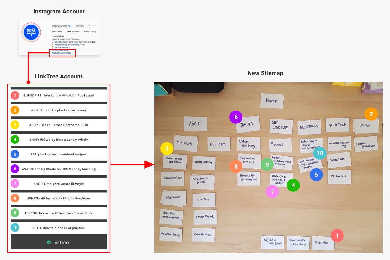
The Instagram account hosted a link to a list of resources that would offer the user more call to action if made available on the website. Taking this information into consideration, I merged the list of resources into the existing sitemap to accommodate additional user flows.

UI design: create consistency with existing brand

Keeping the existing brand intact, I took inspiration from the current website and Instagram account.

The new sitemap changes the information architecture to include more resources and offers the user more call to action
New Sitemap: Consolidating an external list of resources with the main website.
CONCEPT & CONTENT STRUCTURE

More Data Chunking

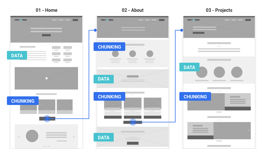
The wireframes follow a simple user flow from the Home page, to the About page, to the Impact page. The plan was to fold in chunks of data about funding/impact to build transparency and communicate Lonely Whale’s authenticity throughout the web experience.

The wireframes use content chunking in the content structure to create a consistent user experience
Wireframes: Integrating chunks of information & additional data into the web experience.

UX Scenario: The user becomes aware, learns more, joins movement

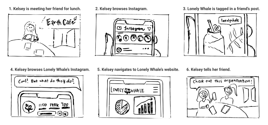
Consistent with Lonely Whale’s strong digital presence and the user’s habits, the user discovers the organization through a friend’s post on Instagram and curiously navigates from Instagram to Lonely Whale’s website. The user recognizes a consistent tone across both platforms, appreciates the transparency of information, and feels encouraged to join the movement.

The user flow follows the user’s decision-making process and her conversion from someone who is skeptical to someone who believes in the organization. The end result is partially ideological and in practice would translate into action and conversation.

The storyboard visualizes how the user learns about Lonely Whale and wants to join the movement
UX Scenario: The user explores Lonely Whale's website with curiosity & quickly sees an organization that is making a difference.
PROTOTYPING & USER TESTING

User Testing Scope: Trust & Comprehension

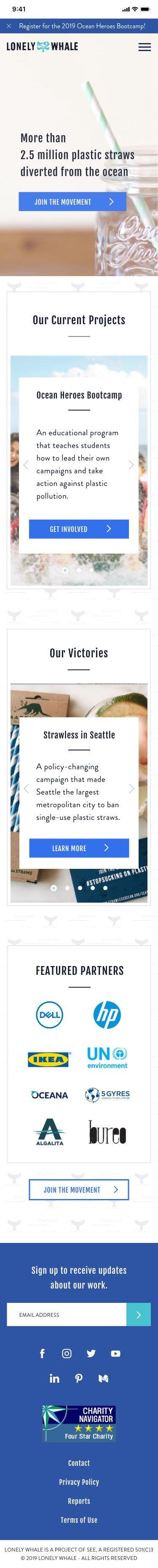
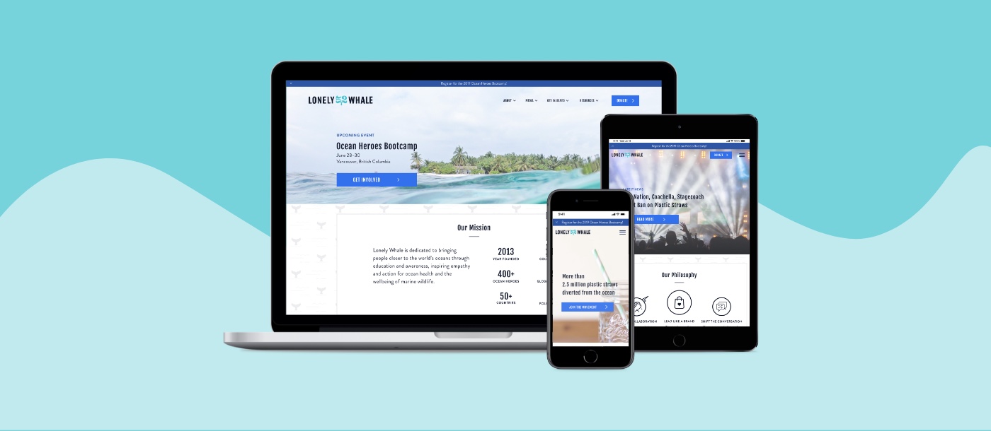
Prototypes were built across 3 breakpoints (desktop, tablet, mobile), but tested on mobile in accordance with the technical habits of the target user.

1.

Recruiting

5 digital savvy modern millennials tested the mid-fidelity mobile prototype. The goal was to test users’ understanding of the organization before applying visual design.

2.

Testing

  • Can you describe what the organization does?
  • How do you feel about this organization?
3.

Opportunities

  • Remove excess information
  • Organize projects chronologically or by relevance
  • Rephrase vague descriptions
Feedback from user testing showed that the user needs a stronger call to action
User Testing Feedback: Users were unsure what information was the most important & were looking for a stronger call to action.

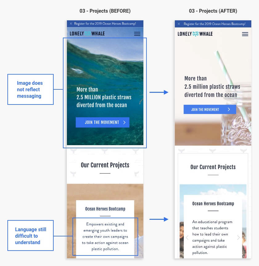
Brand colors and imagery were applied to a high-fidelity prototype that was user tested with 3 more digital savvy modern millennials. Comprehension improved significantly, however feedback suggested that the imagery could better support the content.

Feedback from more user testing showed that user comprehension could be improved through changes in imagery and word choice.
More User Testing Feedback: The imagery could better reflect the content.

High Fidelity Screens (Mobile)

Task: Learn more about Lonely Whale, establish trust, and join the movement.

1 - Home

High-fidelity mobile mockup includes quick facts to show users why they can trust Lonely Whale

2 - About

High-fidelity mobile mockup shows how Lonely Whale takes action

3 - Our Work

High-fidelity mobile mockup organizes Lonely Whale's work into current projects and achievements
Lonely Whale high-fidelity mockups on desktop, tablet, and mobile

Future Opportunities

Add micro-interactions. Animations would enhance the user experience and add delightful moments to otherwise ordinary tasks such as donating.

Create additional page templates. The content structure for the “Media,” “Get Involved,” and “Resources” sections would need to be redesigned to maintain a consistent user experience.