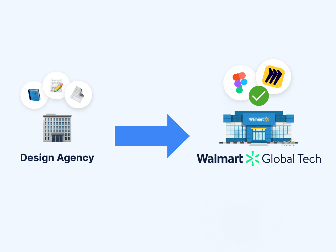
Walmart's 56,000 Home Office associates manage their own devices, software, and tech issues. However, the tools to support them were scattered across four disconnected systems. Most associates weren't tech-savvy and technical support was unreasonably hard to find.
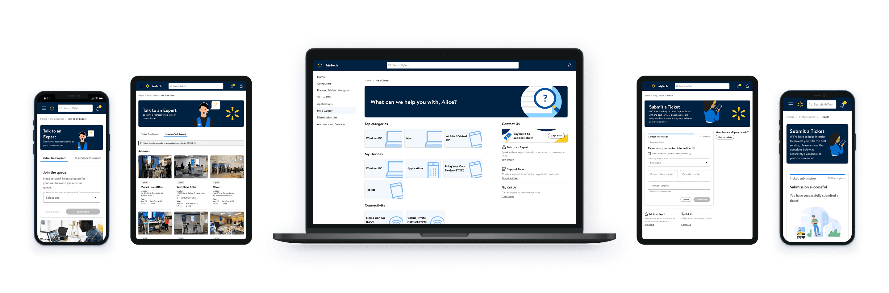
MyTech is Walmart's enterprise self-service platform for device management, security, and technical support. I led the UX design to integrate tech support into MyTech, enabling help from one central place.
37%
#1
INDUSTRY
Enterprise Web & Mobile, Associate Experiences, Internal Tools
Business Objective
Cost Avoidance
MY ROLE
As the UX Lead, I handled cross-functional alignment, pattern analysis, visual design, and handoff.
TIMEFRAME
14 weeks
TEAM
1 UX Researcher
3 UX/UI Designers (including me)
Cross-functional partners in Product, Business, and Engineering

Consolidate technical support into a single, structured entry point that prioritizes self-service, surfaces contextually relevant resources, and aligns with Walmart’s internal support workflows to reduce unnecessary ticket escalation.
Before the pandemic, Walmart Home Office associates received technical support in person. The shift to remote work forced non-tech-savvy associates to troubleshoot device issues on their own, often by filing a support ticket.

Business Goals
Best Outcomes at Lowest Cost
Recommend solutions that fit associates' needs at the best value possible.
Maintain Productivity
Save time and money by providing associates with self-supporting solutions.
Mitigate Security Risks
Ensure associates are safe from data leaks and exposure of personal information.
Increase User Satisfaction
Boost associate confidence that the business will provide support quickly and efficiently.
Baseline Metrics
$5.57
cost per ticket
249K
tickets per year
(37% hardware specific)
$1.39M
annual ticket costs
Our team inherited an exploratory survey, which gave us a baseline understanding of associate experiences and expectations for a tech support platform.

Jeni W.
"Getting good tech support is not very easy, which is unfortunate."
Job Family:
Human Resources
Tech Expertise:
Not-tech-savvy
Goals:
Find/get help easily
Use devices for work
Pain Points:
Fragmented support
Help too general
Technical jargon
Broken links
User Insights
The 2 most frequent tasks had the least satisfaction. (1) finding self-help; (2) submitting a ticket
84% expect to open a ticket
81% expect to talk to tech support
74% expect to make an in-person or virtual appointment
Associates had several options for Tech Support including: word of mouth, phone calls, and internal websites.
Ahead of decommission, I audited the "Tech Bar" website. I found that while the website aimed to support associates through FAQs, videos, and additional resources, the page was difficult to navigate and contained many redirects.

Online tech support resources included MyTech, ServiceNow, and Tech Bar (to be replaced by MyTech).
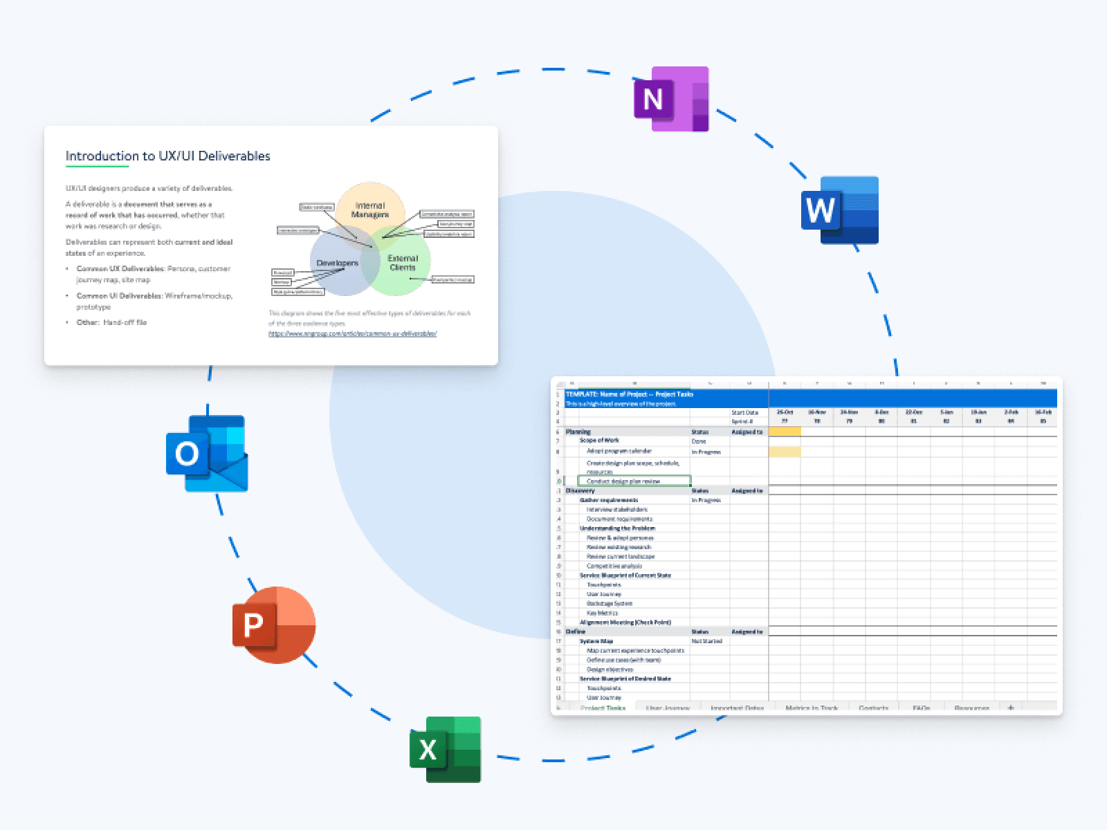
I conducted a competitor analysis of 25+ companies that spanned consumer products, enterprise tools, and Walmart's customer-facing tools.
My job was to apply these proven patterns in a way that worked specifically for Walmart's non-tech-savvy workforce.


Our Principal Designer established a 4-Level Help Framework that mirrored industry-standard support models.
My contribution within this framework:
I designed the information hierarchy and the flow between levels — specifically, how an associate moves from L1 —> L2 —> L3 without losing context. The framework told me what to build. I determined how the framework translated into visual design.

Surface the right help at the right time. Users escalate only when lower levels fail. Expert access is always visible.
As an associate… I want to understand technical information in context of the task, so I don't need outside help to make sense of what I'm looking at.
Clear labels
Plain language
Personalization
Tooltips
Status updates

As an associate… I want to find answers to my tech issues without having to know the right terminology, so I can resolve problems on my own.
Clear navigation
Articles & videos
Search

As an associate… I want to request expert support without needing to understand my own system specs, so I can ask for help even when I don't know what's wrong.
Schedule an appointment
Call tech support
Submit a ticket

USER FEEDBACK & ITERATION
Removing the Help Panel and
"Ask Sam" Chatbot
The UX researcher conducted concept testing with 8 Walmart associates to validate the designs before engineering investment.
7 of 8 users confused by the Help Panel. They expected the help icon to open an inline tooltip, not slide out a panel that felt like navigation away from their current task.
7 of 8 users did not recognize "Ask Sam" as a chatbot. They expected the icon to open a tooltip. When it opened a chat window, they expressed confusion and hesitation.
I removed the help panel and chatbot entirely, replacing with inline tooltips and persistent expert access in the sidebar.

"I would rather submit a ticket than use a chatbot."
Failure & Learning Opportunity: Testing confirmed what I should have caught earlier. We had a Kano Analysis that ranked the chatbot as dysfunctional and a survey that showed only 47% of associates wanted chatbot functionality — the lowest-ranked feature of anything tested. I was aware this prior research existed, but was not confident in its methodology. Instead, stakeholder enthusiasm fueled investment in the chatbot feature, which performed poorly (again) in testing. This bias is something I learned to watch out for in future work.

I prepared and led the engineering handoff in partnership with my colleague.
The handoff documented user flows across all four help levels, design system component usage, design decision rationale (not just specifications), and micro-interaction guidance for state changes and form validation.


ENTERPRISE METRICS
Driving Impact and Results
The Help Center launched to 56,000 Walmart Home Office associates globally and became the most-used self-service feature on the platform within the first year.
Savings (Post Launch, May – Dec)
Adoption (Post Launch, May – Dec)